
I didn’t understand the appeal of the white iPhone when it first came out. To me, “white” has usually been a colour reserved for household appliances, medical equipment and linens. Mobile phones were supposed to be a dark colour - somber grays, blacks, or, if you live in Japan, any variety of sparkly pinks, blues and reds.
But white? For a mobile phone? It just seemed so… sterile. A device more seemingly at-home in a dentist’s office, as opposed to the centre of one’s personal and professional life. Dress shirts are white so as to serve as a blank slate to match other colours and accessories to them. Table cloths are white so as to accentuate the sumptuous textures of the foods placed upon them.
But my phone - I want that to have character. White will not do. Okay for my iron, my blender, my refrigerator. But not for my phone.
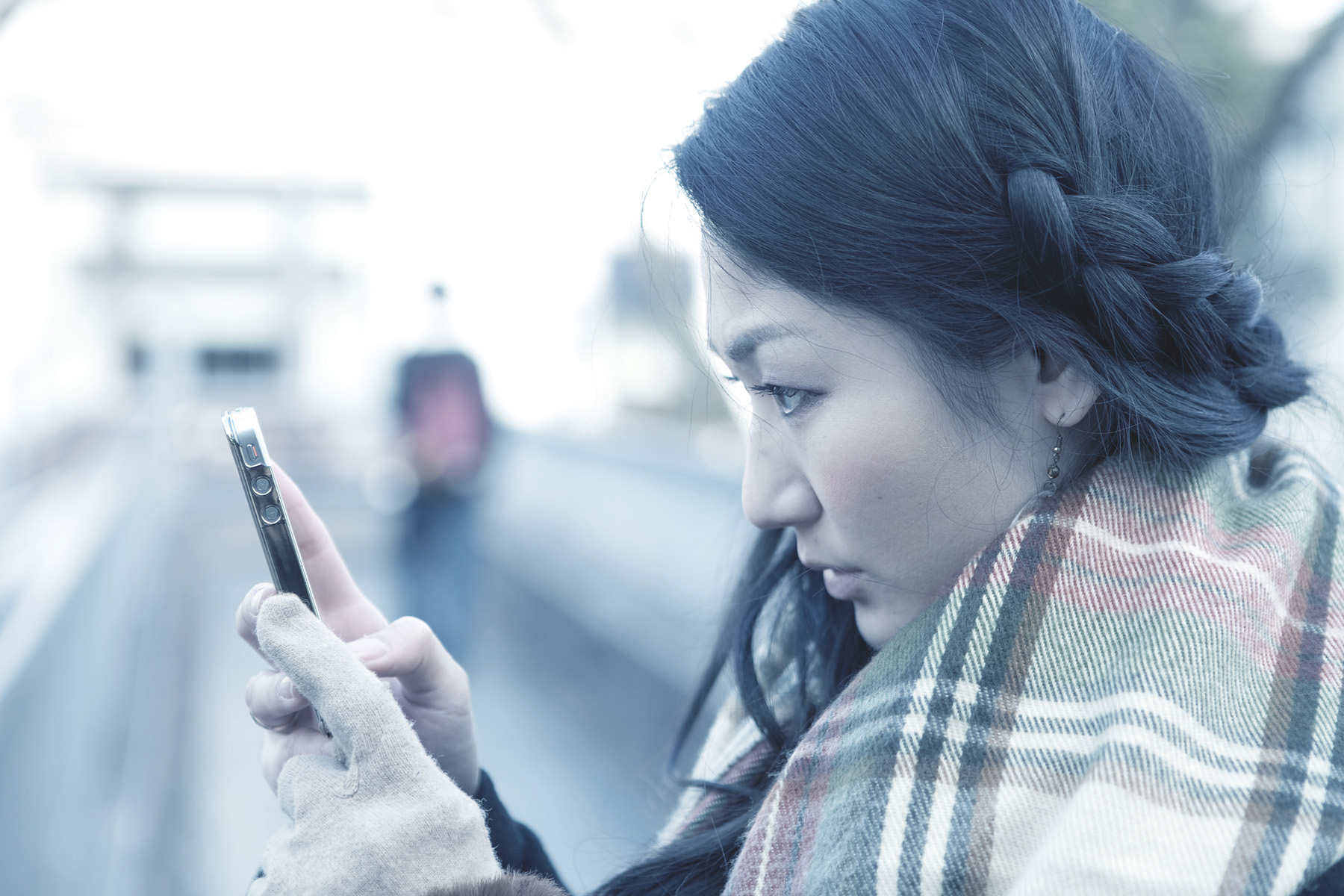
And yet, on a frigid, gray, sleeting day in Harajuku, she pulls out her white iPhone. It appears completely normal. No incongruity, none of the previous prejudice or associations of blandness, banality, or lack of character attached to said colour prior.
And I think of caramel coffee and amber sheaves of sunlight streaming down on morning tables, rooms bathed in warm golden-tinged light. The pines, brushed aluminum and tempered glass of the room decor. With what ease a white would fit in such scenes!
Why did I dislike white for mobile phones before, I wonder?