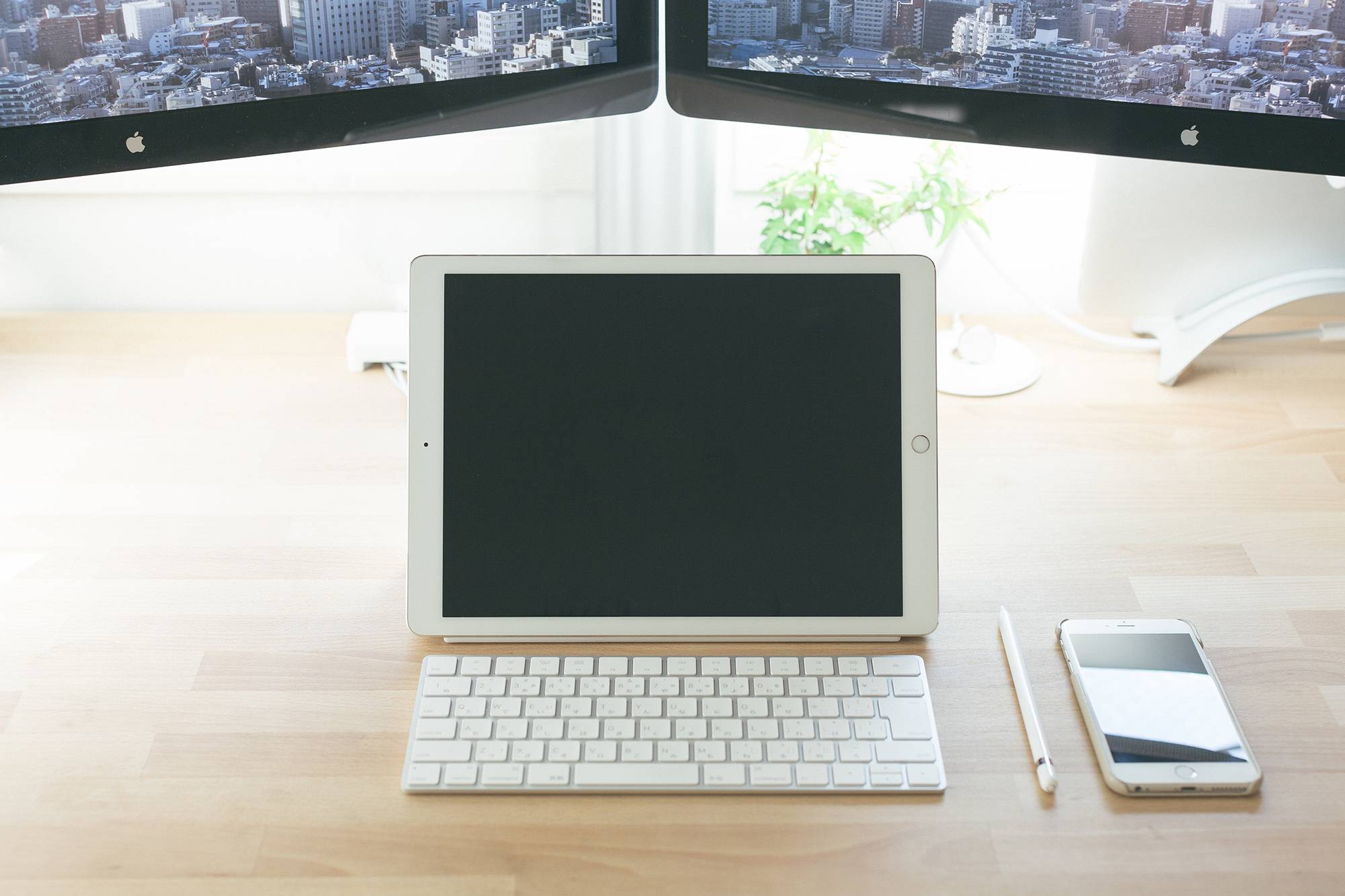
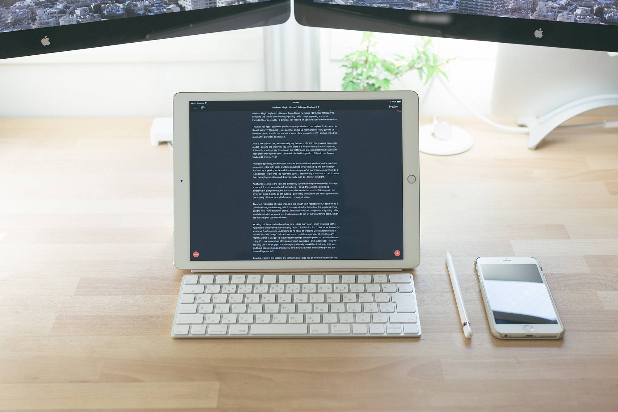
In our previous review of the new Apple Magic Keyboard we mentioned the surprisingly good match it made with the iPad Pro and thought we would expand upon this with a few first impressions, in no particular order, and with far less editing than it needs.
Towards a Fuller Laptop Experience
The function keys all work perfectly with the iPad Pro - allowing a closer than ever laptop experience - we found ourselves seamlessly adjusting the screen brightness, switching song tracks and adjusting the volume whilst typing this document in a cafe directly from the keyboard without skipping a beat - just like we would on a real laptop.
The productivity gains extend beyond the function keys of course - using the keyboard maintains the exact same keyboard layout we’re accustomed to in our everyday computing experience, bringing the iPad Pro closer to a computer in concept. Being based in Japan, we naturally prefer the JIS (Japanese) keyboard layout - this is available in the Japanese MacBooks and keyboards, but the iPad Pro keyboard cover comes only in a single “universal” format which places all the various punctuation keys in odd places relative to the keyboards we use in all other parts of our lives. European users can use their own native layouts with the respective Magic Keyboards of course, rather than striking arcane combinations to force € symbols, etc.
In execution there are other more subtle interaction advantages in using the Magic Keyboard as well. One telling example is the language switching function - on the iPad Pro keyboard cover, this requires striking the language input button which brings up the graphical on-screen input mode switching dialogue - repeated key strikes swaps between the modes and pausing for a second or tapping the screen with your finger will dismiss the dialogue with the new input mode selected. Overall the entire interaction takes about 1~2 seconds which doesn’t sound like a lot until you consider how often a Japanese/English bilingual switches between the two input modes in any given task - those 1~2 seconds really start to add up over the course of a few hours.
In contrast, the Magic Keyboard input mode keys work exactly as they do on a full sized Mac, even when paired with the iPad Pro - which is to say, instantly and transparently - no on-screen input mode switcher, no pausing or tapping required - strike it once and you’re in Japanese, strike the other key and you’re in English (or whatever input modes you choose to assign) - with 100% confidence. This functionality - and the decrease in inertia that it enables - alone is powerful reason for us to switch to the Magic Keyboard + iPad combination full time.
Reduction of Inertia - Reclaiming the iPad Moment
In terms of lightness the Magic Keyboard is identical or perhaps even lighter than the iPad Pro keyboard cover. More importantly than the outright weight savings is the reduction in inertia.
Whilst undeniably convenient in the way that it attaches and remains affixed to the iPad Pro, the heavy weight and necessary rigidity of the keyboard cover dramatically increases the “inertia” of the entire setup. One of the key advantages of the iPad over a laptop computer was the instantaneousness of the interaction - pull it out, unlock the screen (transparently, if one has TouchID enabled) and begin your action - regardless of where you are. In comparison, laptops need to pulled out, set on rigid flat surfaces, opened, wait for the screen to turn on, type to unlock… etc. The barrier between thought and action is considerably higher in the latter than the former. (Which would you rather deal with in an airport security line to check something? An iPad or a laptop?)
However, the iPad Pro keyboard cover shifts this dynamic a bit - the weight and rigidity of the cover necessitates a degree of fumbling after pulling the device out of a bag that only exacerbates the size challenges of the iPad Pro. Additionally, it tends to flop heavily behind the device when held in the hand almost forcing you to search for a flat surface to set the entire contraption down upon. Finally, the weight of the cover tends to strain the magnets - it doesn’t outright fall off of course, but it feels precarious and less solid when picked up than perhaps we would like and perhaps most tellingly we increasingly find ourselves taking it off whenever possible.
The Magic Keyboard by contrast is completely separate allowing it stay in a bag except for when explicitly required. Pulling out the iPad Pro and diving into an interaction suddenly becomes far easier than before - the airport security line scenario once again entering the realm of possibility.
There are some downsides of course - one is that we still require some way to hold up the iPad whilst typing on the keyboard. For this the normal iPad Pro cover serves admirably - we considered other alternatives such as the Twelve South Compass 2 tripod stand, but ultimately found the cover to be much more stable and functional.
And of course, the keyboard must be carried separately - in practise we found it light and slim-profile enough that we could toss it and leave it in even a slim briefcase without worries but we could see how some people would prefer an integrated solution.
Aesthetics
Then there’s the aesthetic of the entire setup - in our opinion the worst part of the iPad Pro keyboard cover is the material and colour - an odd feeling plastic membrane and bizarre dark grey colour that didn’t really match any official Apple colourway, let alone our preferred white iPad or the white Apple Pencil.
By contrast the white keys and brushed aluminium of the Magic Keyboard matches the established colour schemes perfectly and looks exactly correct when paired with a white iPad, white Apple Pencil and the white Pro Cover, as seen in the photo above.
Conclusion
So far we’ve used this combination for a few days straight now and have found ourselves more productive than before. More importantly, we find ourselves more pleased with the overall experience - aesthetics are important to us and finally being able to hide away the bizarre off grey textured smart cover has resulted is simply enjoying leaving our iPad out more often than before (let’s face it, an iPad Pro is a luxury purchase no matter how one looks at it - and visual enjoyment is part and parcel of the benefit of any luxury good). The reduction in inertia has lead to greater enjoyment in actually using the iPad as well - for the first time yesterday we reached for our iPad whilst at our desk to watch a video. For a regular iPad that is a mundane and completely common-place enough interaction interaction but due to the awkwardness of the smart cover it is one that we hardly ever performed with our iPad, preferring simply to watch it on the desktop… and it was refreshing to reclaim that use case in practise.
More to come after a few more weeks, we suppose.


